
Rubik's Cube Animation using CSS
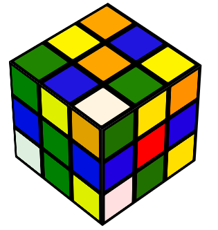
As I posted in my old blog, CSS Loading Animation for AJAX Requests, I have been playing with the CSS3 Animation and Transform properties for few days now, and finally I came up with something interesting to share. And that’s a Rubik’s Cube spinner animation with changing color of the boxes with NO JavaScript at all. All the animation and transformation is done using the CSS3 attributes. This is truly amazing and shows the power of the CSS and future of the web.
Before I go ahead and give you brief tutorial on how this was accomplished. Here is in action (you should have latest Chrome, FireFox, Safari or Opera browser to view to correctly):
Note: For all the sample CSS in this code, I’m using the -webkit- prefix for the CSS3 properties. You will need to add the corresponding pre-fixes for each type of browser you want to support. For example, for the transform-style, you need add following four lines to support all the major browsers:
1 2 3 4 | -webkit-transform-style: preserve-3d; -moz-transform-style: preserve-3d; -o-transform-style: preserve-3d; transform-style: preserve-3d; |
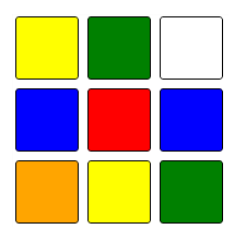
I know, it’s looks very ugly, and I hate it. But you have to compromise on this. If you can’t do this, I will recommend look at LESS. Now coming back to the Rubil’s Cube animation, the first important task is to create one face/side of the Rubik’s Cube. Fortunately, this is more simple than it sounds. You just need correct set of styles, and few lines of HTML code.
1 2 3 4 5 6 7 8 9 10 11 12 13 14 15 16 17 18 19 20 21 22 23 24 25 26 27 28 29 30 31 32 33 34 35 36 37 38 39 40 41 42 43 | .rubik_cube_face { text-align: center; width:200px; height:200px; } .rubik_cube_face span { display: inline-block; border:1px solid black; float:left; vertical-align: middle; width: 28%; height: 28%; margin: 2% 2%; background: black; border-radius: 3px; } .rubik_cube_face span:nth-of-type(1) { background: yellow; } .rubik_cube_face span:nth-of-type(2) { background: green; } .rubik_cube_face span:nth-of-type(3) { background: white; } .rubik_cube_face span:nth-of-type(4) { background: blue; } .rubik_cube_face span:nth-of-type(6) { background: blue; } .rubik_cube_face span:nth-of-type(5) { background: red; } .rubik_cube_face span:nth-of-type(7) { background: orange; } .rubik_cube_face span:nth-of-type(8) { background: yellow; } .rubik_cube_face span:nth-of-type(9) { background: green; } |
And here is the HTML:
This should create something like this:
Okay, one step achieved. Now the hard part, how to display this in a 3D box style. The answer lies in transform and transform-style styles of the CSS3. The idea is that we create six DIV elements for the each side/face of the cube and then transform them (by rotating them along X or Y axis) to move them to proper side of the cube. Here is the key CSS styles to achieve this:
1 2 3 4 5 6 | #cube .front { -webkit-transform: rotateY( 0deg ) translateZ( 100px ); } #cube .back { -webkit-transform: rotateX( 180deg ) translateZ( 100px ); } #cube .right { -webkit-transform: rotateY( 90deg ) translateZ( 100px ); } #cube .left { -webkit-transform: rotateY( -90deg ) translateZ( 100px ); } #cube .top { -webkit-transform: rotateX( 90deg ) translateZ( 100px ); } #cube .bottom { -webkit-transform: rotateX( -90deg ) translateZ( 100px ); } |
What translateZ does is move each of these sides from their center by half of the size (100 pixel), so that they form the correct sides of the parent cube. BTW, my key source of sample for the cube animation was from from the following site (a big Thanks to author for writing this wonderful article):
http://desandro.github.com/3dtransforms/docs/cube.html
Here is the sample CSS and HTML to make a rotating cube:
1 2 3 4 5 6 7 8 9 10 11 12 13 14 15 16 17 18 19 20 21 22 23 24 25 26 27 28 29 30 31 32 33 34 35 36 37 38 39 40 41 42 43 44 45 46 47 48 49 50 51 52 | .container { width: 200px; height: 200px; position: relative; margin: 70px auto 40px; -webkit-perspective: 2000px; } #cube { width: 100%; height: 100%; position: absolute; -webkit-transform-style: preserve-3d; -webkit-transform: translateZ( -100px ); -webkit-animation: spinCubeWebkit 9s infinite linear; } #cube .figure{ width: 196px; height: 196px; display: block; background: black; position: absolute; border: 2px solid black; opacity:0.6; } #cube .front { -webkit-transform: rotateY( 0deg ) translateZ( 100px ); background: red; } #cube .back { -webkit-transform: rotateX( 180deg ) translateZ( 100px ); background: blue; } #cube .right { -webkit-transform: rotateY( 90deg ) translateZ( 100px ); background: green; } #cube .left { -webkit-transform: rotateY( -90deg ) translateZ( 100px ); background: yellow; } #cube .top { -webkit-transform: rotateX( 90deg ) translateZ( 100px ); background: white; } #cube .bottom { -webkit-transform: rotateX( -90deg ) translateZ( 100px ); background: orange; } @-webkit-keyframes spinCubeWebkit { 0% { -webkit-transform: translateZ( -100px ) rotateX( 0deg ) rotateY( 0deg ); } 100% { -webkit-transform: translateZ( -100px ) rotateX( 360deg ) rotateY( 360deg ); } } |
Okay, and here it’s in action:
http://jsfiddle.net/syedgakbar/yg34R/
Once this is done, all you have to do is combine both of the above code blocks i.e. draw 9 blocks on each six side of the cube. Again, using the correct CSS cascading and html tags, this can be accomplished easily. Here is the HTML for this:
For the CSS, please check the “CSS” page of the first JSFiddle block. I’m sorry, it’s long and this page is already very cluttered. Here is the link to the Rubi’s Cube Animation html page.
http://www.syedgakbar.com/app/blog/rubik-cube.html
All this should give you a nice rotating Rubik’s Cube. You can leave this here, or you can add some JavaScript to make this a real Rubik’s Cube i.e. where user can rotate it in 3D, plus also move the rows and columns to actually solve this. It would be nice experiment, and who knows, may be one day I complete that and share that as well.
Tags: Animation, CSS, Rubik's Cube, Transform
Very nice animation of a Rubiks Cube. Nice and smooth. Well done.